Shinex
- Category
- Branding
- Sector
- B2B cleaning supplies
- Location
- Souda, Chania
- Year
- 2024
Shinex is a B2B supplier of professional cleaning products based in Souda, Chania, in business since 2014. Mene & Jo designed the company's rebrand, from the logo to the vehicle fleet and the packaging.
Identity
- Logo
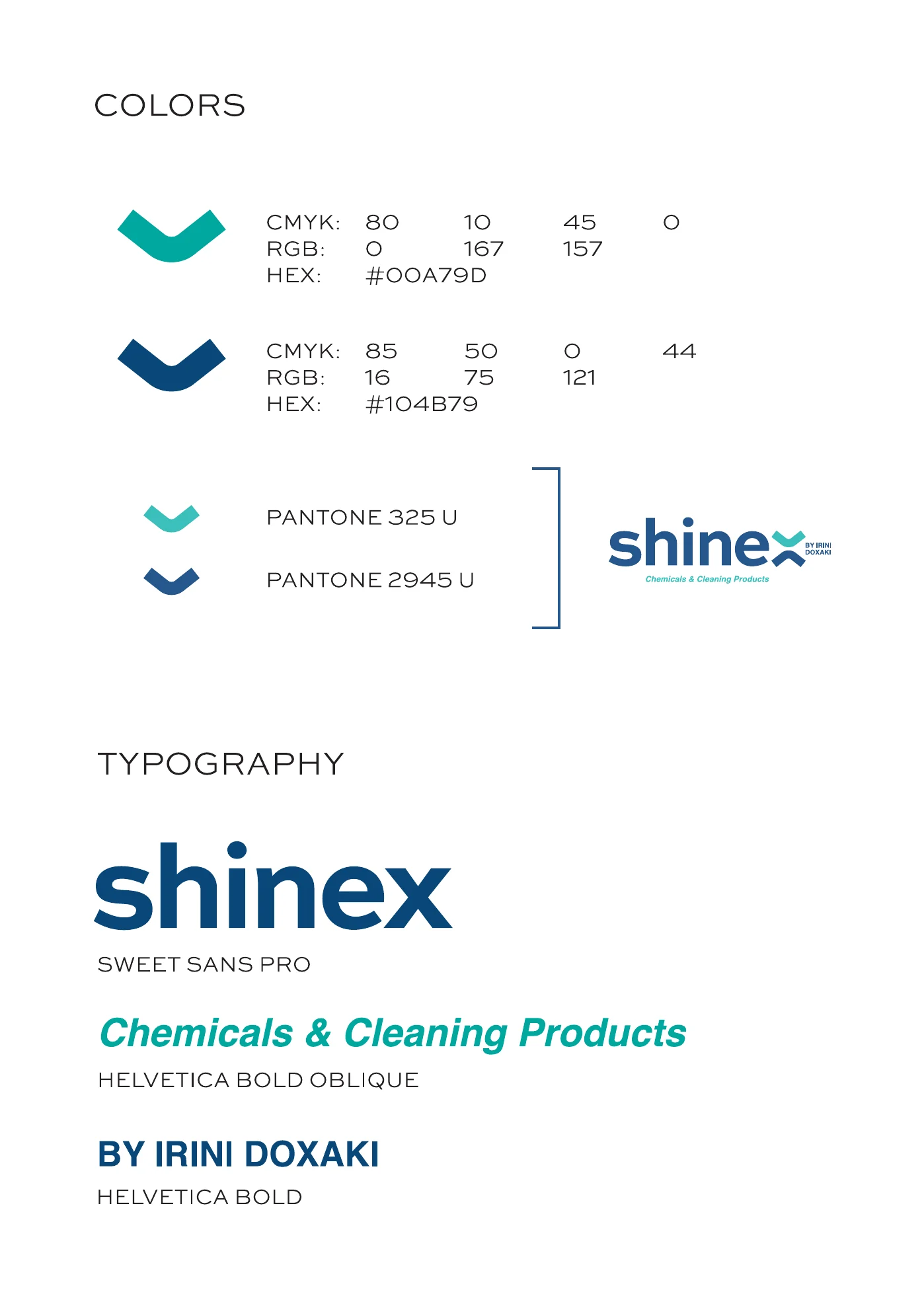
- Colour palette
- Typography
Applications
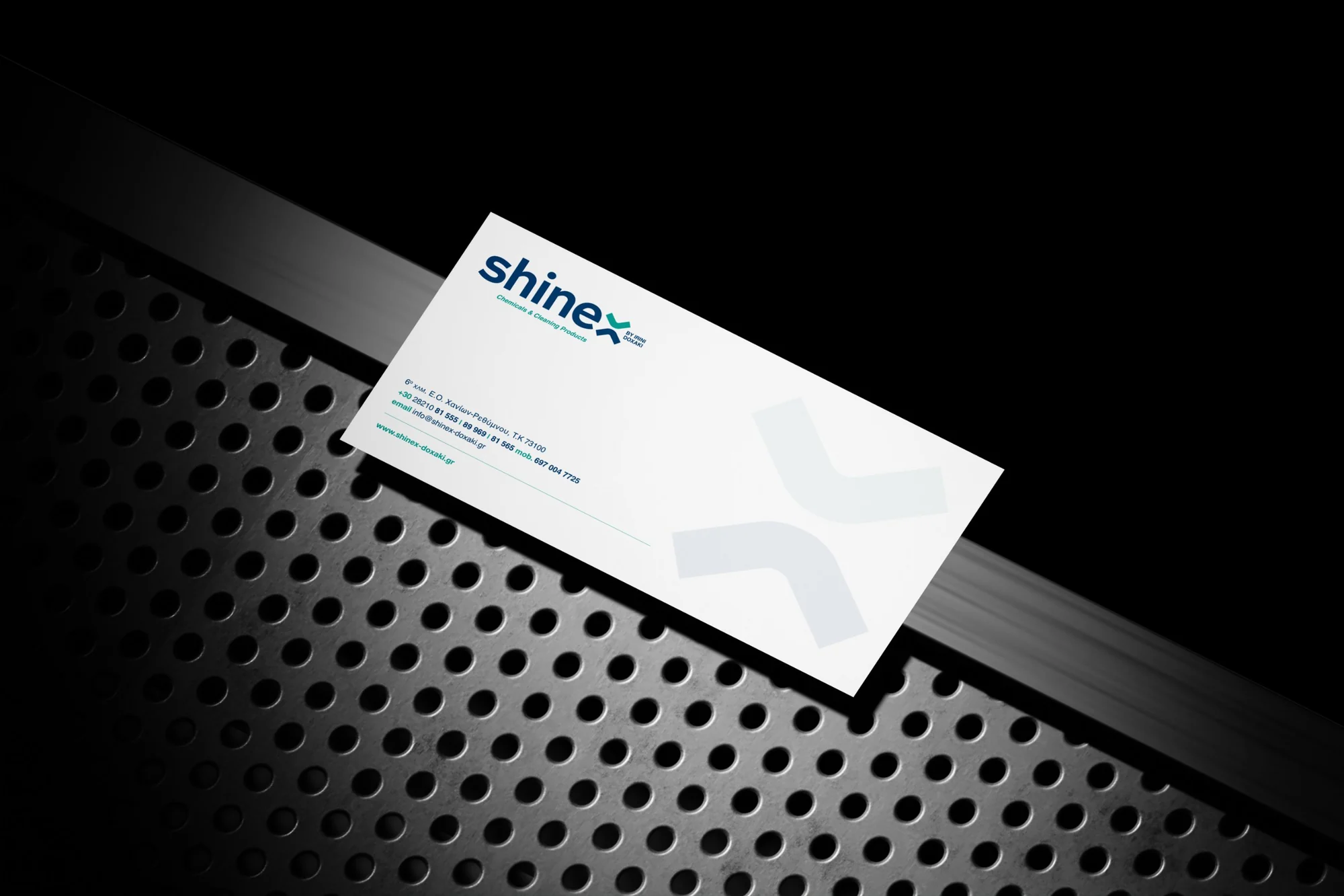
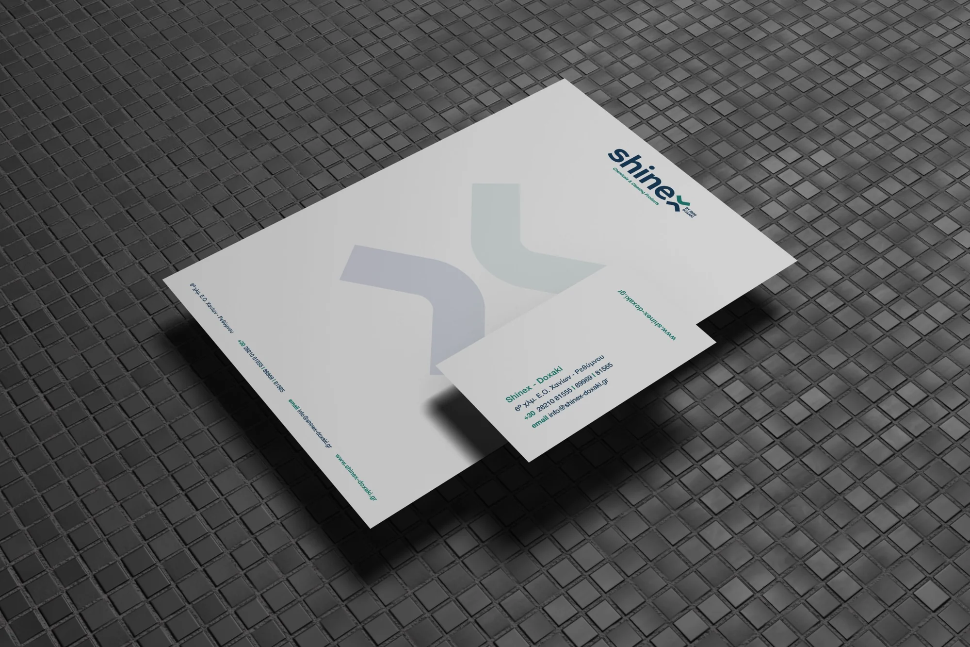
- Stationery
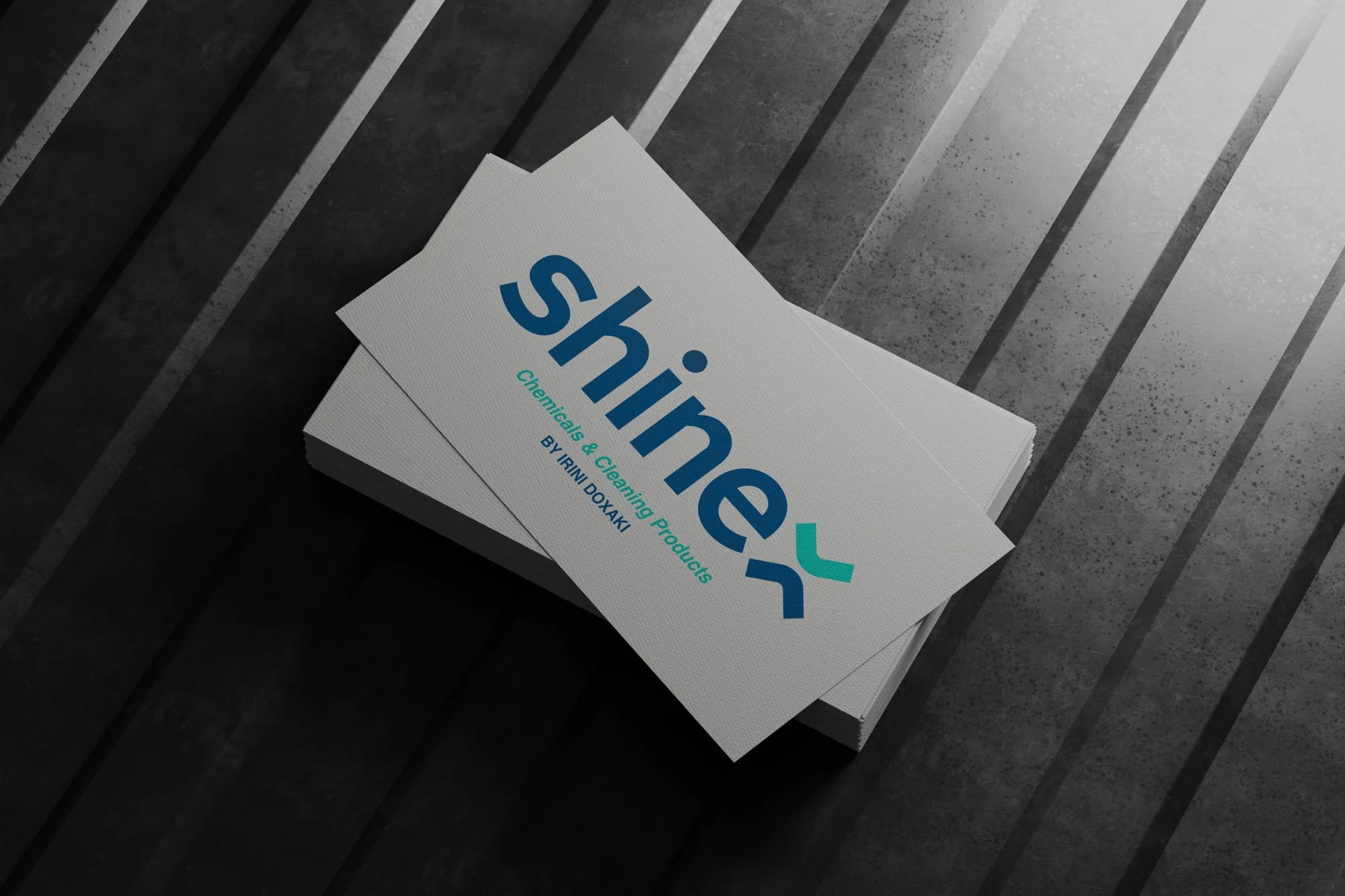
- Business cards
- Fleet graphics
Packaging
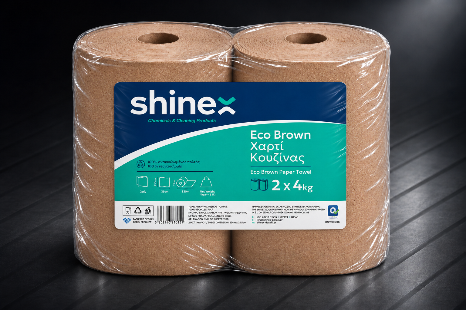
- Eco Brown label
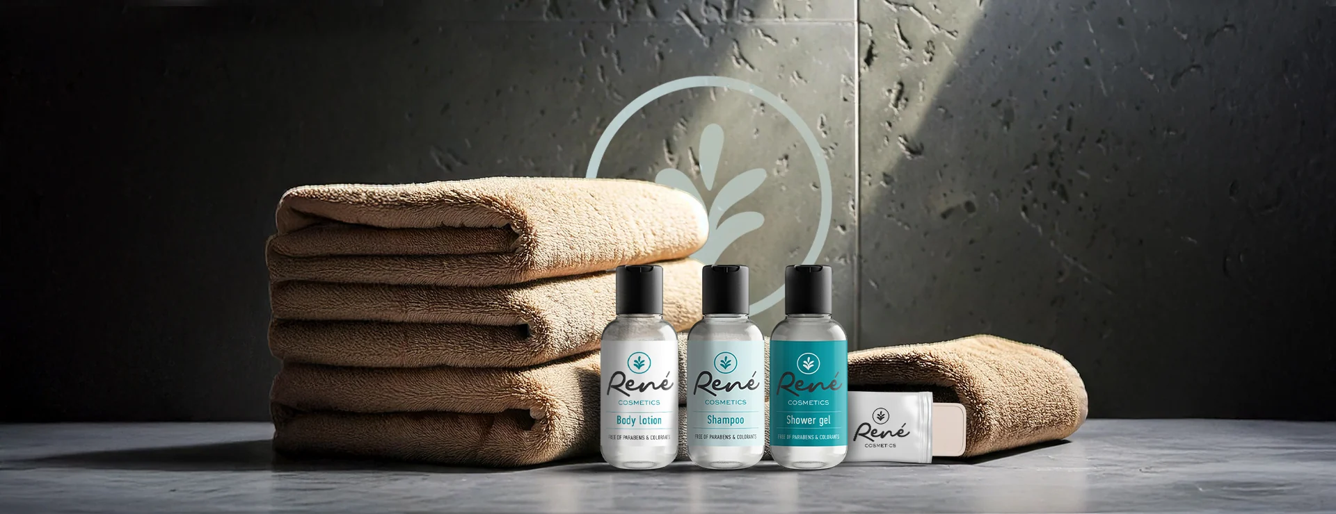
- René Cosmetics
Digital
- Logo animation
The brief
Shinex supplies hotels, restaurants, rental properties and businesses across Chania with cleaning chemicals, detergents and paper products. Its existing identity no longer matched the professional clients it serves. The company needed a brand that works on a van as well as on a label and stands out from generic supplier brands.
What we did
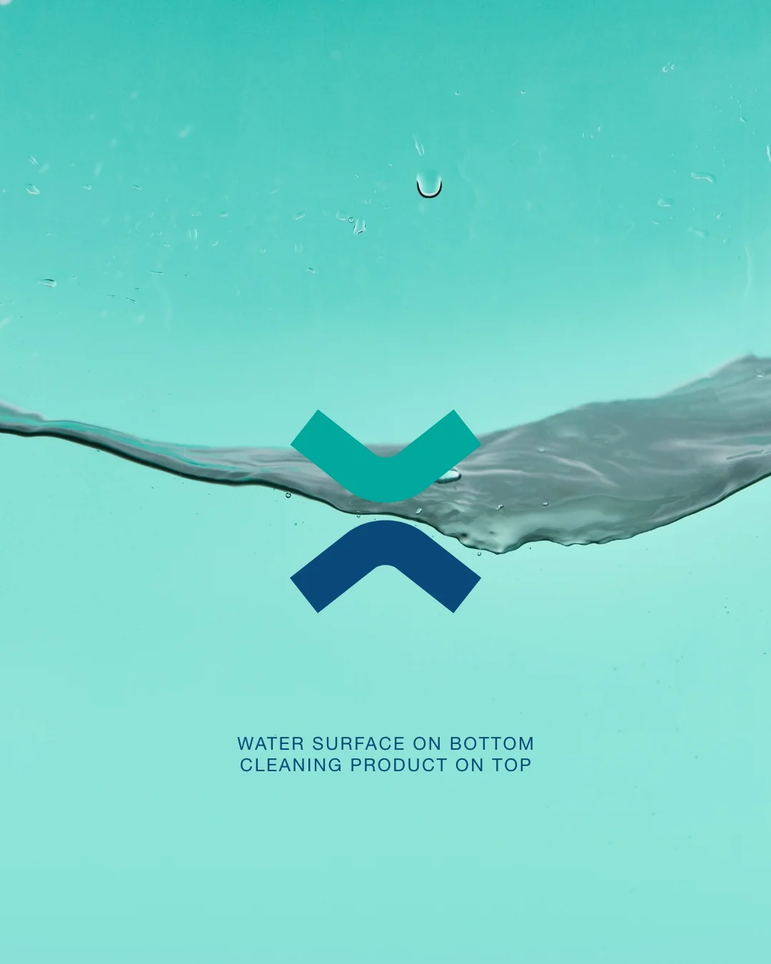
We designed a lowercase wordmark in deep blue with a two-tone "x" that reads as a drop and a tick: clean, done. The identity was applied to stationery and business cards, to the vehicle fleet and to packaging, starting with the Eco Brown professional paper towel. We also created the name, logo and the five labels of René Cosmetics, the company's hotel amenities line. One recognisable brand at every point where a client meets Shinex: the van that delivers, the card, the roll on the shelf and the hotel bathroom.